Xlsx Chart
-
Hello,
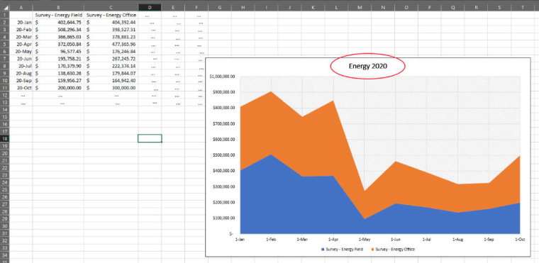
I've been tasked to create an XLSX report. The image below is the desired result, with the "..." added by me in order to indicate to you that a report can have any number of columns (market category) and rows (month of a year). In this case, there are two market categories (Survey - Energy Field and Survey - Energy Office) and the first 10 months of 2020. But a report could contain more market categories and more (or less) months. And the title of the chart could be anything (in this case it is Energy 2020).
I've looked at the example Xlsx Chart report, and it is somewhat helpful. I can create the basic template, but I would like to know how to generate the report taking into account the variables that I've pointed out above.

-
By "taking into account the variables that I've pointed out above" I mean there can be x number of market categories and x number of months. This is where I'm stuck.